Black and White or Colors?
It is sometimes difficult to make a decision if a photograph looks better in colors or in blank and white. Every one has ones own view about it. So do I. I follow some generic guidelines for this.
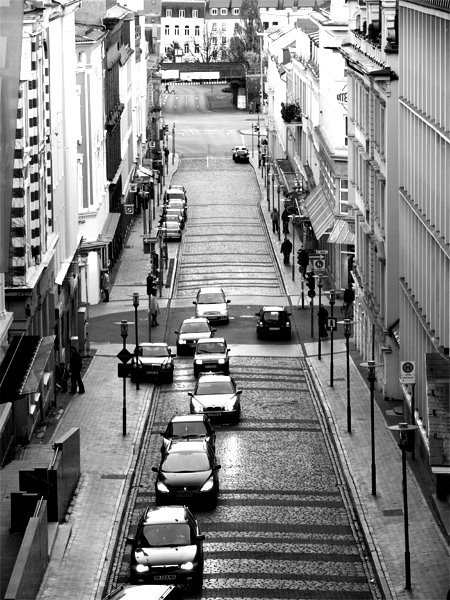
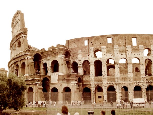
Black and white gives more depth to a photograph due to capability to carry more contrast. Whereas you cannot use that much of contrast in a colored photograph, due to color saturations. If you want to show old age effect, historical buildings, rustic effect, too many shadows or depth in general, better choose black and white. They look more thought provoking without colors. If you want to show flowers, parties, celebrations, something depicting life, cheer and vibrations, better choose colored photograph.


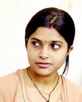
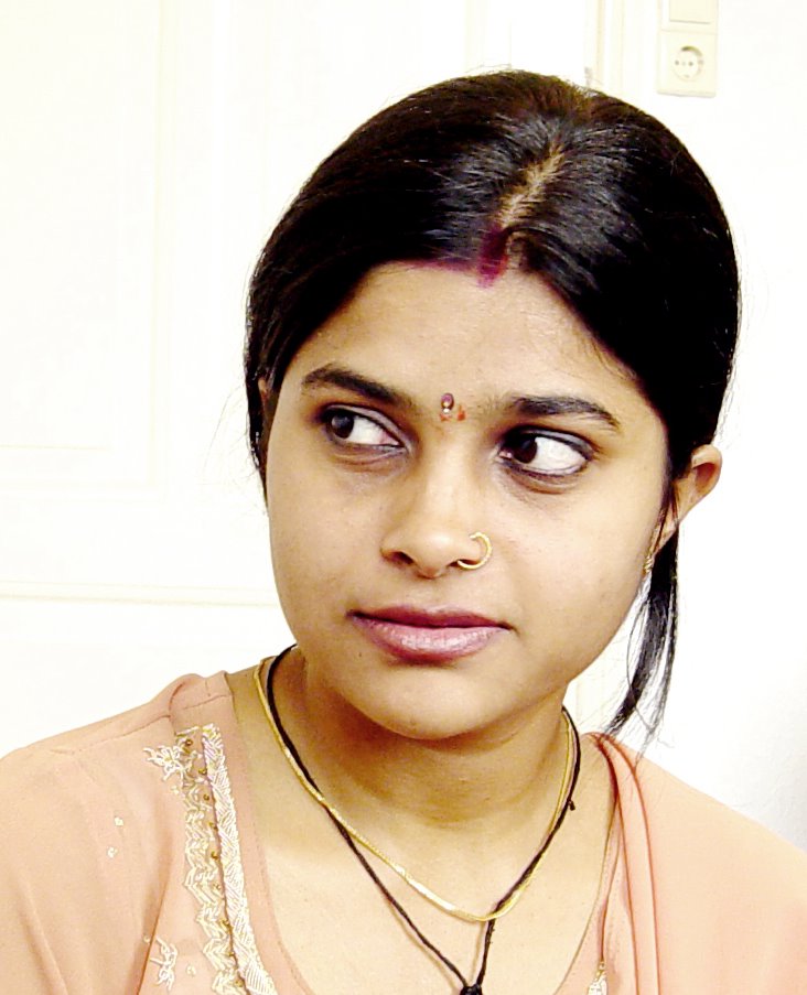
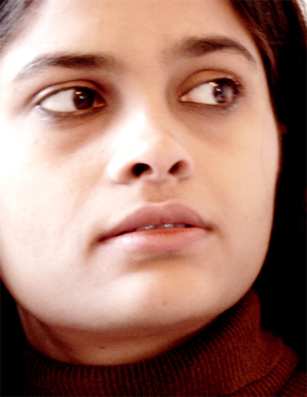
Portraits:
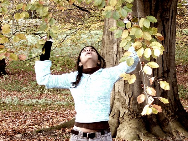
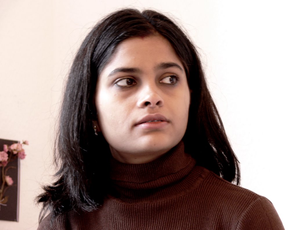
In case of lonely portrait or very close ones, B&W looks pretty good. In case if it is taken in a group or in party, better keep it colored.

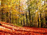
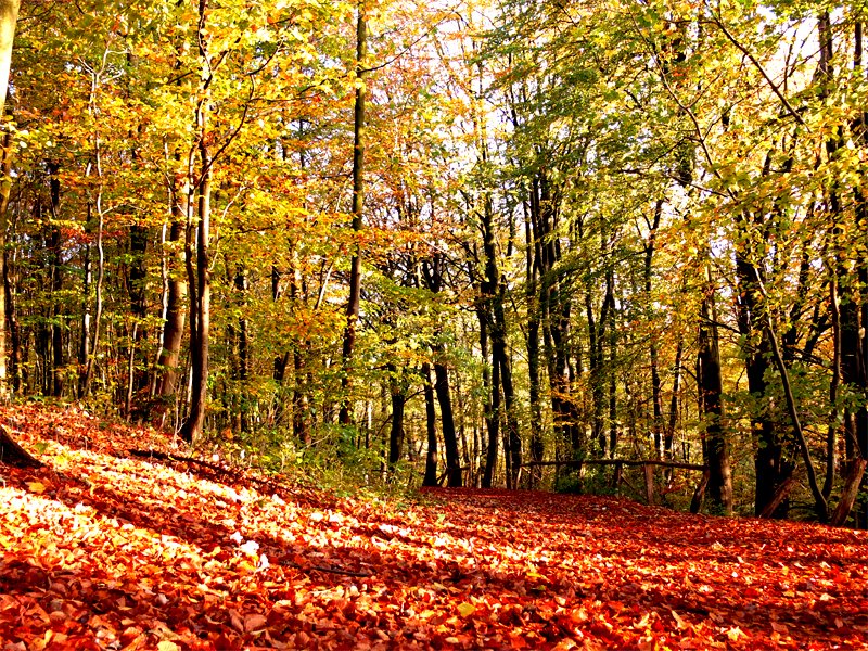
Landscapes:
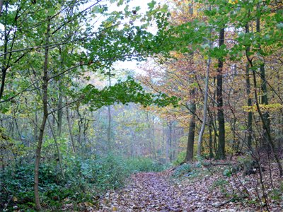
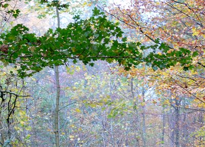
Normally landscapes look better in color, but if depth is important, black and white could serve better.

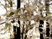
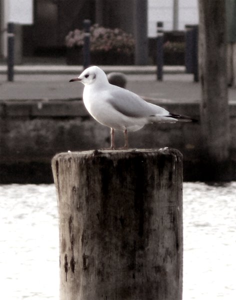
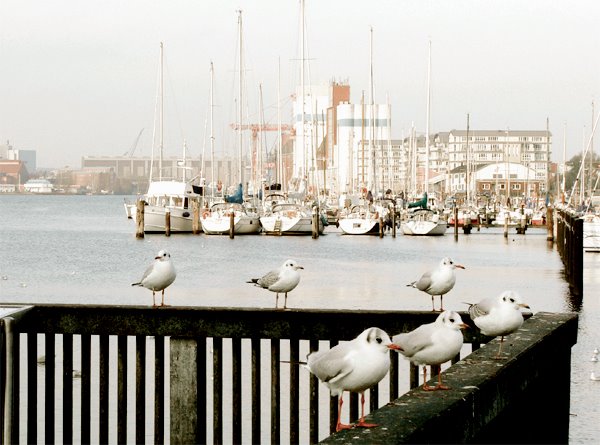
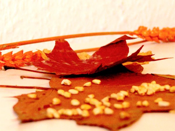
Now, what about something in between? Neither B&W nor colored.
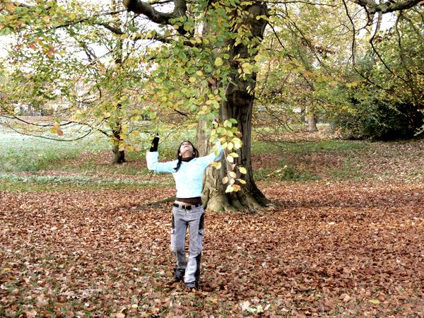
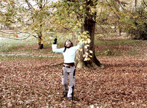
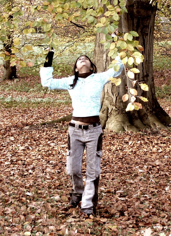
Believe me it is a lot interesting to play with very less colors, as it has characteristics of both, colors and B&W. By reducing color saturations and increasing the contrast, you can achieve both depth and colors in the same photograph. Take a look at some of the examples.


A photograph is like a poem, it should be read in a particular manner to feel it best.
Black and white gives more depth to a photograph due to capability to carry more contrast. Whereas you cannot use that much of contrast in a colored photograph, due to color saturations. If you want to show old age effect, historical buildings, rustic effect, too many shadows or depth in general, better choose black and white. They look more thought provoking without colors. If you want to show flowers, parties, celebrations, something depicting life, cheer and vibrations, better choose colored photograph.

Portraits:
In case of lonely portrait or very close ones, B&W looks pretty good. In case if it is taken in a group or in party, better keep it colored.

Landscapes:
Normally landscapes look better in color, but if depth is important, black and white could serve better.
Now, what about something in between? Neither B&W nor colored.
Believe me it is a lot interesting to play with very less colors, as it has characteristics of both, colors and B&W. By reducing color saturations and increasing the contrast, you can achieve both depth and colors in the same photograph. Take a look at some of the examples.

A photograph is like a poem, it should be read in a particular manner to feel it best.
posted by Amit Agarwal at 11/26/2005 03:29:00 AM
0 comments
![]()
![]()

